FutureFunds Responsive Landing Page
I designed a responsive landing page concept for FutureFunds to communicate financial services clearly across desktop and mobile experiences. The goal was to improve clarity, hierarchy, and usability for users exploring services and taking action. This project focused on making complex service information easier to understand and navigate.
Project Details
- Role: UX & Visual Designer
- Tools: Figma
- Deliverables: Responsive web and mobile landing page concepts
Problem
- Financial services can feel overwhelming or difficult to understand quickly
- Users need clear hierarchy and guidance to navigate service options
- A landing page must communicate trust, clarity, and next steps across devices
Audience
- First-time visitors exploring financial services
- Users comparing service options and looking for clear information
- Mobile and desktop users needing a responsive, easy-to-scan experience
Process
Information Hierarchy
I structured the page to highlight primary services, build trust through clear messaging, and guide users toward calls to action without overwhelming them.
Responsive Design
I created both desktop and mobile versions to ensure the experience remained clear, readable, and usable across screen sizes.
Visual Design
I used strong visual hierarchy, clean spacing, and approachable styling to make the content feel trustworthy, organized, and easy to understand.
These decisions resulted in a cleaner, more structured experience that supported clarity and action.
Solution
- Created a clear, service-focused landing page structure
- Designed responsive layouts for both desktop and mobile
- Used hierarchy and spacing to improve readability and user flow
- Built a more approachable and trustworthy visual experience
Visuals
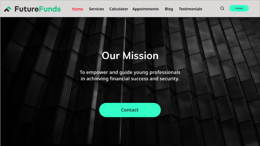
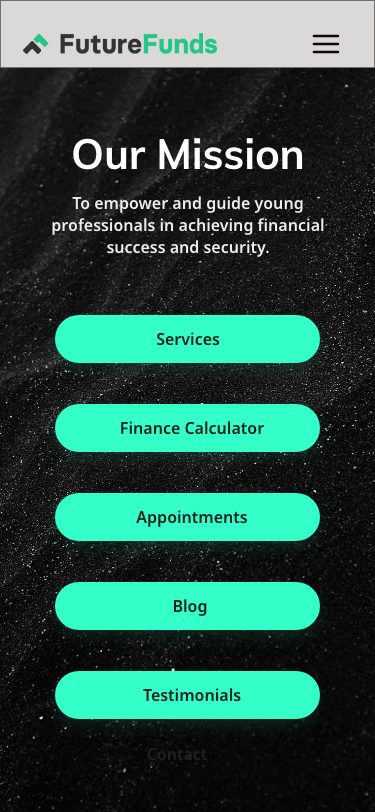
Final responsive landing page concepts showing desktop and mobile adaptations of the same user experience.
Desktop version
Mobile version
Outcome
- Created a clearer and more approachable financial services experience
- Showed how the same experience could adapt effectively across desktop and mobile
- Improved content hierarchy, readability, and call-to-action visibility
What I Learned
- Clear hierarchy is critical when presenting complex service information
- Responsive design requires prioritizing what matters most on smaller screens
- Strong visual structure can improve trust, readability, and usability
